
pythonのMatplotlibモジュールで棒グラフを作成したい方,グラフを発展させた積み増しグラフを描きたい方に本記事では作成手順を解説して行きます.サンプルプログラムをコピペして適時必要なデータへ書き換えて使って頂ければと思います.
スポンサーリンク
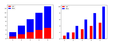
シンプルな棒グラフを描く
棒グラフの作成はAxes.bar()に引数として横軸値のxと縦軸値のyを入れます.まずは簡単なグラフを描いてみましょう.
import numpy as np
import matplotlib.pyplot as plt
fig = plt.figure()
ax = fig.add_subplot(1,1,1)
x = np.array([1, 2, 3, 4, 5])
y = np.array([5, 10, 15, 20, 25])
bar=ax.bar(x,y)
plt.show()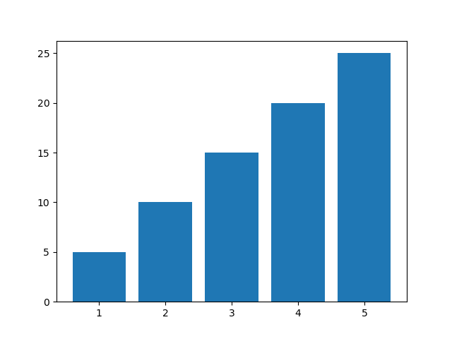
棒グラフ本体と枠線の色と太さを変える
棒グラフと枠線の色や太さなどの設定はAxes.bar()に引数を渡す事で可能です.
・Axes.bar()の引数
| 引数 | 効果 |
| color | 棒グラフの色を変える |
| width | 棒グラフの幅を変える |
| edgecolor | 枠線の色を変える |
| linewidth | linewidth |
import numpy as np
import matplotlib.pyplot as plt
fig = plt.figure()
ax = fig.add_subplot(1,1,1)
x = np.array([1, 2, 3, 4, 5])
y = np.array([5, 10, 15, 20, 25])
bar=ax.bar(x,y,color="red",width=0.3,#棒グラフの色と太さ指定
  edgecolor="black",linewidth=1.5)#枠線の色と太さ指定
plt.show()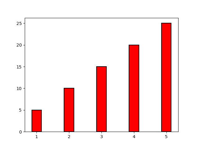
タイトラベル,X軸ラベル,Y軸ラベルを表示
タイトルラベルはAxes.set_title(name,引数1,引数2,…)の引数より設定できます.
・Axes.set_titleの引数
| 引数 | 効果 |
| size | 文字サイズ |
| weigh | 文字の種類 |
X軸ラベルはax.set_xlabel(name,引数1,引数2,…)の引数より設定できます.
Axes.set_xlabelの引数
| 引数 | 効果 |
| fontsize | 文字サイズ |
| weight | 文字の種類 |
Y軸ラベルはX軸ラベルと同じようにax.set_ylabelの引数より設定できます.
棒グラフのラベルはAxes.bar()の引数tick_labelで設定できます.
import numpy as np
import matplotlib.pyplot as plt
fig = plt.figure()
ax = fig.add_subplot(1,1,1)
x = np.array([1, 2, 3, 4, 5])
y = np.array([5, 10, 15, 20, 25])
name = ['A', 'B', 'C', 'D','E']
bar=ax.bar(x,y,tick_label=name,  #目盛ラベル
           color="red",width=0.3,#棒グラフの色と太さ指定
  edgecolor="black",linewidth=1.5)#枠線の色と太さ指定
ax.set_title("Title",size=12)#タイトルラベル
ax.set_xlabel("X-axis", fontsize=12, weight='bold')#x軸のラベル
ax.set_ylabel("Y-axis", fontsize=12, weight='bold')#y軸のラベル
plt.show()
複数の棒グラフを表示
複数の棒グラフを表示させるには、棒グラフの幅を引数widthで細くして追加するグラフ位置を元のグラフに重ならないようにX座標をずらします.
import numpy as np
import matplotlib.pyplot as plt
fig = plt.figure()
ax = fig.add_subplot(1,1,1)
x = np.array([1,2,3,4,5])
y1 = np.array([1, 2, 3, 4, 5])
y2 = np.array([2, 4, 6, 8, 10])
bar=ax.bar(x,y1,width=0.3,color="red",label="red")
bar=ax.bar(x+0.4,y2,width=0.3,  #
  color="blue",label="Blue")
plt.legend()#凡例表示
plt.show()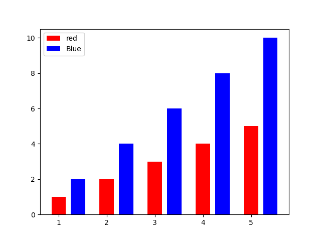
積み増し棒グラフの作成
積み増しグラフを作成するには引数bottomを使うとすでに作成した棒グラフの上部から追加する棒グラフが生成されます.
import numpy as np
import matplotlib.pyplot as plt
fig = plt.figure()
ax = fig.add_subplot(1,1,1)
x = np.array([1, 2, 3, 4, 5])
y1 = np.array([1, 2, 3, 4, 5])
y2 = np.array([2, 4, 6, 8, 10])
bar=ax.bar(x,y1,color="red",label="red")
bar=ax.bar(x,y2,color="blue",label="Blue",bottom=x)
plt.legend()
plt.show()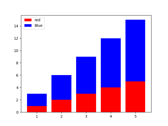

コメント