
pytonのMatplotlibモジュールでヒストグラムを描きたいけど如何したら良いのだろうか?または、積み上げヒストグラムを作成したいけど解らないと言った方のために本記事では,シンプルなヒストグラムの描き方から棒の設定,積み上げヒストグラムをコピペで作成できます.早速Matplotlibを使ってヒストグラムを描いていきましょう.
スポンサーリンク
ヒストグラムて何
ヒストグラムは統計グラフの一種で収集したデータをある値(階級)で区切たものを横軸に取り、この範囲にある個数(度数)を縦軸としたものです.棒が高くなればその区切りの範囲(階級)での数が多いことにになります.データの分布を視覚的に認識するのに便利です.
シンプルヒストグラム
Matplotlibでヒストグラムを描くにはAxes.hist()より行います.
まずは、シンプルなヒストグラムを描いてみましょう.
[IN]
import numpy as np
import matplotlib.pyplot as plt
fig = plt.figure()
ax1 = fig.add_subplot(1,1,1)
x1 = np.random.normal(-2, 1, 1000)
hist=ax1.hist(x1)
plt.show()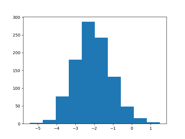
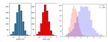
棒の視覚的表示を設定する
棒の幅や色,線のみ表示等の設定はAxes.hist()に引数を渡すことでできます.
・Axes.hist()の引数
| 引数 | 効果 |
| edgecolore | 棒線の色 |
| alpha | 透過度 |
| rwidth | 棒の幅 |
| color | 棒の色 |
| histtype | stepfield :塗りつぶし sep :線のみ表示 |
import numpy as np
import matplotlib.pyplot as plt
fig = plt.figure(figsize=(12.0, 4.0))
ax1 = fig.add_subplot(1,4,1)
ax2 = fig.add_subplot(1,4,2)
ax3 = fig.add_subplot(1,4,3)
ax4 = fig.add_subplot(1,4,4)
x1 = np.random.normal(-2, 1, 1000)
data = np.random.randn(1000)
ax1.set_xlabel("rwidth=0.8")
ax2.set_xlabel("color=red")
ax3.set_xlabel("stepfilled")
ax4.set_xlabel("step")

hist1=ax1.hist(data,edgecolor="0",rwidth=0.8)   #棒の幅
hist2=ax2.hist(data,edgecolor="0",color="red")  #棒の色
hist3=ax3.hist(data,edgecolor="0",histtype='stepfilled') #塗りつぶし
hist4=ax4.hist(data,edgecolor="0",histtype="step")#線のみ
plt.show()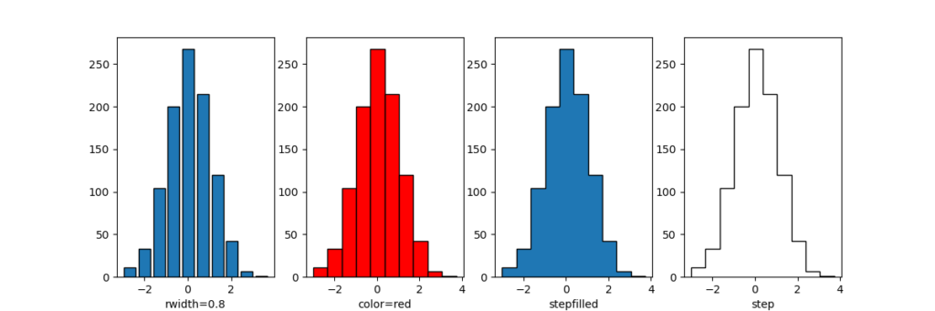
棒の本数及びX軸範囲設定
棒の本数及び横軸の範囲を設定するのはAxes.hist()に引数を引数を渡すことでできます.
・Axes.hist()の引数
| 引数 | 効果 |
| bins | 棒の本数 |
| range | (x.min(), x.max()) X軸範囲の最小値,最大値 |
import numpy as np
import matplotlib.pyplot as plt
fig = plt.figure(figsize=(9.0, 4.0))
ax1 = fig.add_subplot(1,3,1)
ax2 = fig.add_subplot(1,3,2)
ax3 = fig.add_subplot(1,3,3)
x1 = np.random.normal(-2, 1, 1000)
data = np.random.randn(1000)
ax1.set_xlabel("deflt")
ax2.set_xlabel("bin=20")
ax3.set_xlabel("bin=20+range")

hist1=ax1.hist(data,edgecolor="0")   #デフォルト
hist2=ax2.hist(data,edgecolor="0",bins=20)  #h棒の数
hist3=ax3.hist(data,edgecolor="0",bins=20,range=(-2,2)) #棒の数+X軸の幅設定
plt.show()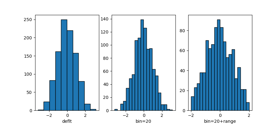
複数のヒストグラムを重ねて表示
複数のヒストグラムを重ねて表示するには,同じグラフ領域Axesに重ねたいデータ数分作ります.
import numpy as np
import matplotlib.pyplot as plt
np.random.seed() #同じランダム値を使う
fig = plt.figure()
ax1 = fig.add_subplot(111)
x1 = np.random.normal(-2, 1, 1000)
x2 = np.random.normal(1, 2, 1000)
key=dict( alpha=0.2,bins=20)
hist=ax1.hist(x1,**key,color="red",label="red")
hist=ax1.hist(x2,**key,color="blue",label="blue")
ax1.legend()
plt.show()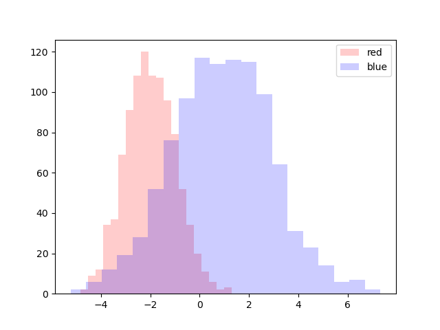
サンプルプログラムではhist=ax1.hist()を2つ作成して、それぞれに別の値を入れてグラフを書いています.
積み上げヒストグラム
積み上げヒストグラムを描くには,Axes.hist()に引数stacked=Trueを渡します.
積み上げるデータをAxes.hist()に順番に配列として記載します.色設定や他の引数も同じです.共通で使う引数は配列を作る必要はありません.
Axes.hist([x1,x2,…]),color=[“red”,”blue”,…],edgecolor=”0″,引数….)
データと色は別々に設定しています.線の色は共通で設定しています.
import numpy as np
import matplotlib.pyplot as plt
np.random.seed() #同じランダム値を使う
fig = plt.figure()
ax1 = fig.add_subplot(111)
x1 = np.random.normal(-2, 1, 1000)
x2 = np.random.normal(1, 2, 1000)
key=dict( alpha=0.2,bins=20)
hist=ax1.hist([x1,x2],**key,stacked=True, #積み上げを宣言
    color=["red","blue"],label=["red","blue"]) #色,ラベル,線の色設定
ax1.legend()
plt.show()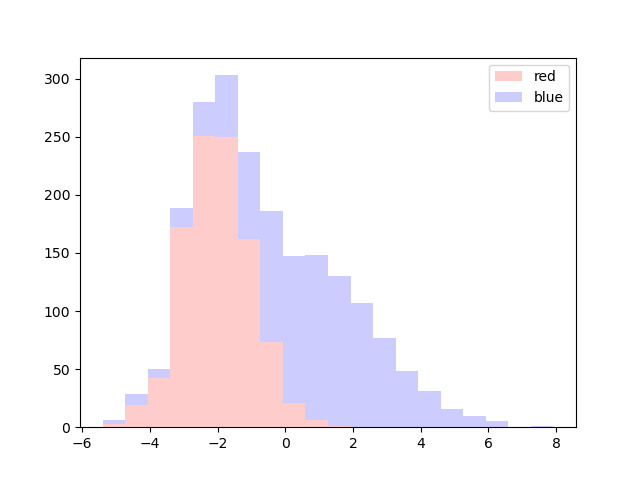
2つのデータが積み上げられました.複数データの階級別の合計値を視覚化するのに便利です.

コメント