
Matplotlibでグラフを描いたけどあまり格好良くない,見栄えの良いグラフを作るのにカスタマイズするのは面倒だ.そんな方にお手軽にスタイリッシュなグラフを描く機能がMatplotlibに備わっていいます。グラフを描く際に1行書き加えるだけです.
スポンサーリンク
Matplotのグラフをスタイリッシュに描こう
Matplotlibには,プロットエリアの見た目を変える変えるスタイルシートが幾つかあります.これをMatplotlib.style(“スタイル”)で呼び出すことでスタイルが反映されます.この宣言はfigの前に必要です.
・Matplotlib.style(“スタイル”)の引数
‘Solarize_Light2’ , ‘_classic_test_patch’ , ‘bmh’ , ‘classic’ , ‘dark_background’, ‘fast’ , ‘fivethirtyeight’ , ‘ggplot’ , ‘grayscale’ , ‘seaborn’ , ‘seaborn-bright’ , ‘seaborn-colorblind’ , ‘seaborn-dark’ , ‘seaborn-dark-palette’ , ‘seaborn-darkgrid’ , ‘seaborn-deep’ , ‘seaborn-muted’ , ‘seaborn-notebook’ , ‘seaborn-paper’ , ‘seaborn-pastel’ , ‘seaborn-poster’ , ‘seaborn-talk’ , ‘seaborn-ticks’ , ‘seaborn-white’ , ‘seaborn-whitegrid’ , ‘tableau-colorblind10’]
import numpy as np
import matplotlib.pyplot as plt
x=np.arange(0.0, 2.0, 0.1)
y=np.sin(2*np.pi*x)

plt.style.use('bmh')  #スタイルを定義

fig = plt.figure()
ax1 = fig.add_subplot(111)
line1=ax1.plot(x, y  ,marker="o" )
line2=ax1.plot(x, y+1,marker="s" )
line3=ax1.plot(x, y+2,marker="*" )
line4=ax1.plot(x, y+3,marker="^" )
# タイトル,凡例,ラベル,グリッドの表示と設定    #
ax1.set_title("bmh")#タイトル
ax1.set_xlabel("X-axis")#x軸のラベル設定
ax1.set_ylabel("Y-axis")#y軸のラベル
labes=["A","B","C","D"]# 凡例のラベル名を定義
ax1.legend(labes)#凡例ラベル設定
plt.show()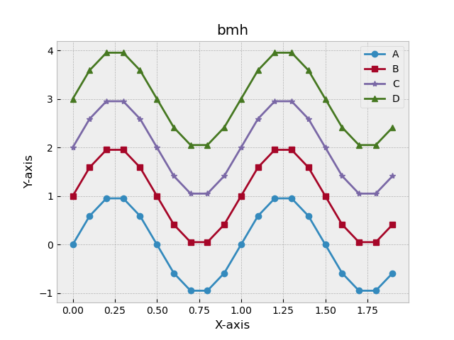
スタイリッシュなグラフができました.
styleの効果
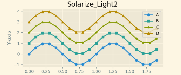
・Matplotlib.style(‘Solarize_Light2’)
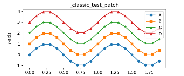
・Matplotlib.style(‘_classic_test_patch’)
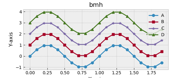
・Matplotlib.style(“‘bmh’)
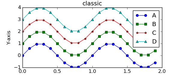
・Matplotlib.style(“‘classic’)
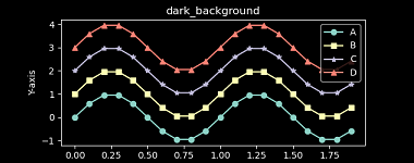
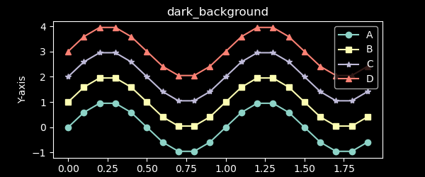
・Matplotlib.style(“‘dark_background’)
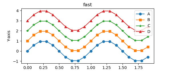
・Matplotlib.style(“‘fast’)
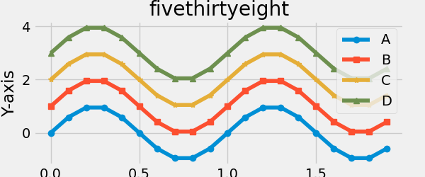
・Matplotlib.style(“‘fivethirtyeight’)
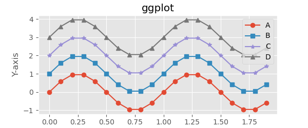
・Matplotlib.style(“‘ggplot’)
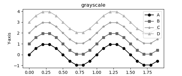
・Matplotlib.style(“‘grayscale’)
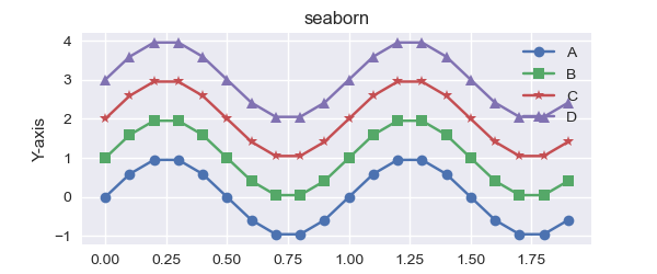
・Matplotlib.style(‘seaborn’)
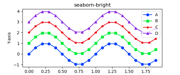
・Matplotlib.style(‘seaborn-bright’)
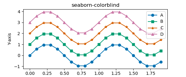
・Matplotlib.style(“seaborn-colorblind)
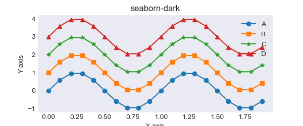
・Matplotlib.style(‘seaborn-dark’)
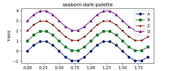
・Matplotlib.style(‘seaborn-dark-palette’)
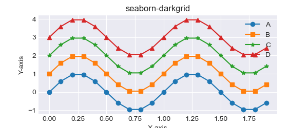
・Matplotlib.style(‘seaborn-darkgrid’)
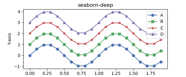
・Matplotlib.style(‘seaborn-deep’)
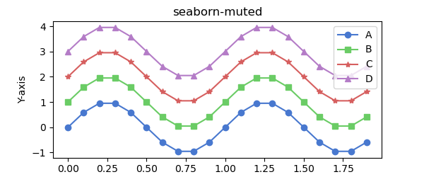
・Matplotlib.style(‘seaborn-muted’)
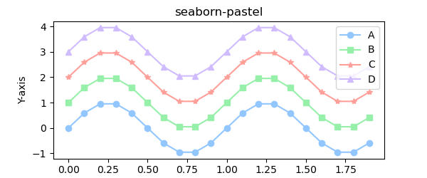
・Matplotlib.style(‘seaborn-pastel’)
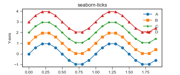
・Matplotlib.style(‘seaborn-ticks’)
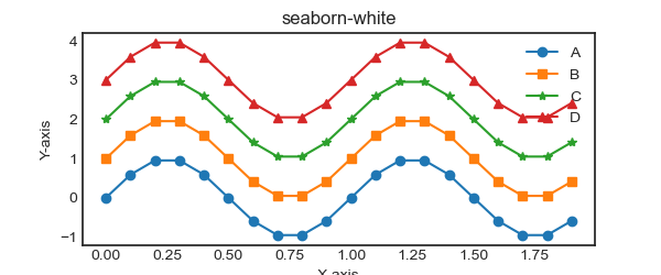
・Matplotlib.style(‘seaborn-white)
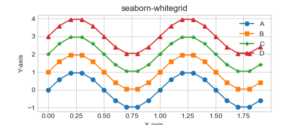
・Matplotlib.style(‘seaborn-whitegrid’)
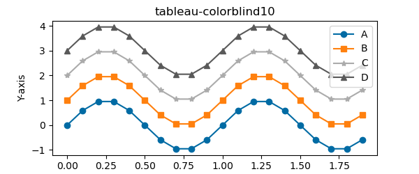
・Matplotlib.style(‘tableau-colorblind10’)
画像の大きさを決めるスタイル
・Matplotlib.style(‘seaborn-paper ‘) #(640×440px)
・Matplotlib.style(‘seaborn-notebook’) #(800×550px)
・Matplotlib.style(‘seaborn-talk’) #(1040×715px)
・Matplotlib.style(‘seaborn-poster’) #(1280×880px)

コメント